
Colour and its myriad meanings:
A semiotic perspective
A leisurely stroll through a shopping aisle on a Sunday surely is a small indulgence that the marketer in me looks forward to! There is something exciting about the neatly stacked packs of products, each screaming out loud to get my attention –Almost makes me the consumer feel very important. On the other side, my ‘Semiotic-Eye’ starts aching to be put to use so it can deconstruct as many complex signs on the packs. Off late my ‘Semiotic-Eyes’ seem to be paying attention to a design element that is often ignored or taken for granted – Colour!
For a moment let us imagine looking at a green coloured pack of a personal care brand; ignoring all other design elements on the pack, what would we associate the green colour to? Yes, ‘Naturalness’. But is green the single most potent colour to signal naturalness? Why then do we come across the usage of brown as well in the category of ‘Natural personal care products?’ The discipline of Semiotics has an answer! ‘Colour Semiotics’ introduces the concept of ‘Inter-colour synonymy’ i.e ‘A meaning can be signaled by not one but a wide range of colours’.

Here is another one – White as we are all aware of is used to convey cleanliness because it is culturally codified as the colour of purity. But in its campaign ‘Daag ache hei’, Surf excel uses the same white as a canvas to show ‘Dirt’. This phenomenon is labeled as ‘Intra-colour Antonymy’ i.e. the same colour can have opposite meanings.
A humorous pop-cultural equivalent that explains the above concept was also shown in the movie PK when the ‘Alien Aamir Khan’ struggles to understand how each of the many religions in our culture treat the same white colour – i.e a bride’s colour is Christianity and a widow’s in Hinduism.
All these examples further raise a broader yet pertinent question – ‘How have we managed to learn all these complex colour meanings, the rules of their usage?’ In a semiotician’s world view, the answer lies in ‘Shared Imaginary’ that also contains a ‘Colour dictionary’ from which we all are taught and therefore learn these meanings to navigate the complex sign system that culture is.
A mental colour dictionary’s function is to help us learn the symbolic meanings of colours that have been established by age old conventions. For example, Hindu weddings across the sub-continent, prescribe a colour code for the bridal wear i.e Red (signals fertility), White (Signals purity of the bride) and yellow (Signals prosperity) as a custom. However, over the years, we have seen these colour codes change and customs become less rigid, as evident from the emergence of trends like ‘Wedding colours of the season’ which are prescribed not by traditions but by fashion authorities and influencers. This further asserts one of the key concepts of ‘Peircean semiotics’ i.e. Colour is not deterministic but fluid, variant and in a flux of perpetual change. Therefore, colour meanings and the codes that prescribe their usage are also bound to change with changing culture.

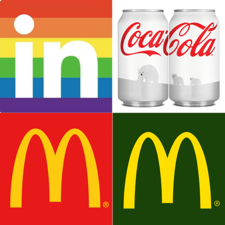
This state of perpetual flux of colour meanings is evident in the world of brands as well. Although logo and brand colours are sworn by and almost set in stone as laid down by brand guideline documents, many national and international brands change their logo colours for a brief while to ‘Rainbow colours’ signaling their support to the LGBTQ movement.
The use of ‘Colour’ as a ‘Change signifying entity’ is not new to brands. Brands like McDonald’s and Coca-Cola in the wake of rise of ‘pro-environmental’ sentiments across the globe have incorporated colours like green (Signaling eco-friendly) and white (Signaling support to Polar Bears) in their visual language.
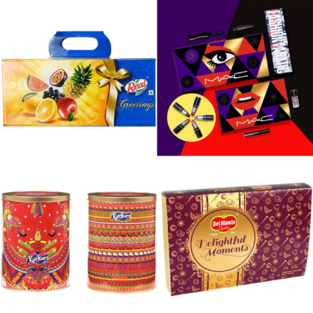
Deeply embedded cultural narratives often find their symbolic representations via colours, as understood from a project done on ‘Diwali and Festival packs’. Most brands (Belonging to categories like F&B , Cosmetics) deviated from their regular brand colour codes and used colours that symbolized the ‘Diwali spirit’. Vibrant colours like Gold, Purple, Orange, Maroon etc are signs of values like ‘Vibrancy’, ‘Grandeur’, ‘Prosperity’.
New age marketing is heavily design led and the modern consumer is more attuned and trained to pick design and subtle visual sensibilities than ever before. In such a reality, Colour can be strategically exploited as a very powerful and potent signifying entity. While the use of colours in marketing is strongly influenced by the discipline of ‘Colour psychology’ which traces colour associations to understand dominant meanings. Colour Semiotics on the other hand sits at the intersection of tracing both- the Symbolic meanings of colour and its Dominant associations through time.
Here are top three ‘Colour Semiotic’ take aways from this article, that you could put to use the next time you work on ‘Colour’ in your communication and design
- Colour Symbolism: Colours derive their meaning from Context (where it is used) and Culture (i.e. set by conventions, rituals, customs etc.) and these meanings are not static but are bound to evolve
- Pro-Tip: Tracing the socio-historic meaning of a colour and its journey to contemporary times often reveals richer and more innovative actionable design ideas
- Colour Dictionary: The presence of an evolving mental colour dictionary allows people to learn these meanings by heart and stay abreast with the colour codes and the culturally permissible rules of their usage
- Pro-Tip: Brand colour codes need not be led by design guidelines alone. Social Media and new age global consumers are likely to appreciate variation in colours, more so if the variations reflect a shared / popular sentiment or ideology
- Inter-colour synonymy and Intra-colour antonymy: Unlike language where the vocabulary is large, the basic colour vocabulary is much smaller in terms of the visual colours and their verbal descriptors. Since a limited number of colours need to convey a wide range of meanings, the same colour can have opposing meanings too.
- Pro-Tip: Designers and marketers need to keep an eye open for these varied meaning/s from their brand colour palette and try to negate any ambiguity that may disrupt coherent messaging in communication