
Changing the Narratives of Black – The Cred Story
To truly appreciate semiotics, one also has to understand that the methodology’s applications are limitless i.e. being a tool that taps into the collective imaginary, it lends itself to the semiotician to study anything and everything that is a part of the imaginary. As a semiotician, I am often amazed by how even the most subliminal signs play a very important role in a sign system towards the creation of newer narratives.
One such ignored yet very powerful sign in the UI / UX context is the ‘Colour’. While colour psychology and its principals are instrumental in aiding designers while developing a UI, a colour’s symbolic meaning that it derives from culture is often ignored. For example, going by colour psychology, the colour blue is often associated with masculinity all across the world, however in the Indian subcontinent, it is also used extensively in giving representation to ‘Dalits’.
In the UI / UX space, most designs choose to play it safe and strictly abide by a combination of the category codes and brand codes. For instance, music and OTT apps often combine black (category norm) with red (Netflix) / Green (Spotify). Similarly, fintech apps combine white (category code) with their brand colours. While playing by category codes and brand codes is a proven strategy, it also lacks differentiation. Therefore wanting to disrupt the market, challenger brands try to challenge existing dominant codes and their narratives.
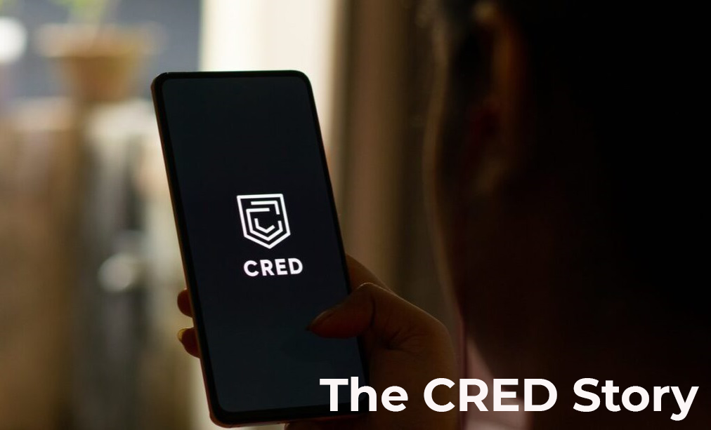
The Cred Story
I still remember a lot of gush and chatter around Cred. While most people of my generation were installing cred out of FOMO, the semiotician in me got curious i.e what made this fintech app so engaging and exciting for millennials, who actually bucket money and financial matters as ‘Serious / Boring’?
One of the reasons was the unique design language of their UI. Unlike other Fintech apps, Cred played around with a lot of established design codes and narratives. More importantly, it made a very bold move by challenging the category’s colour code and adopting black as its theme. Here are two interesting strategies it opted for –
a) Latching onto emergent cultural narratives around ‘Black’
Black in Indian culture is largely associated with evil, darkness and something negative. This probably explains why a lot of fintech companies shy away from using it as their theme color – its negative associations do not assure users of safety and abundance when it comes to their money. But Cred challenged this by identifying emergent cultural narratives around the colour black – i.e drawing either from the party culture / formal work culture, the colour has begun to mean – Cool, Powerful, Elegant. The fact that these emergent meanings are more popular among millennials further helped their brand
b) Borrowing from colour codes and narratives of other categories
Black as established earlier is popular in the entertainment and media category. While it is understandable that money is a serious matter and therefore cannot anywhere be associated with fun and excitement, Cred challenged this notion too and by adopting black, got itself associated with fun and entertainment, thereby building the narrative of ‘Money management is fun’.
While these are only two strategies that Cred used to differentiate itself in the already crowded fintech space, one can only wonder at the endless possibilities of competitive advantage and differentiation that leveraging colour can lead to. At Leapfrog Strategy Consulting, we have worked extensively on colour with clients to use it to their advantage. Colour semiotics is a subject that is of great interest to us as well, and you can also head to our learning centre here, to get some more dope on Colour Semiotics.